
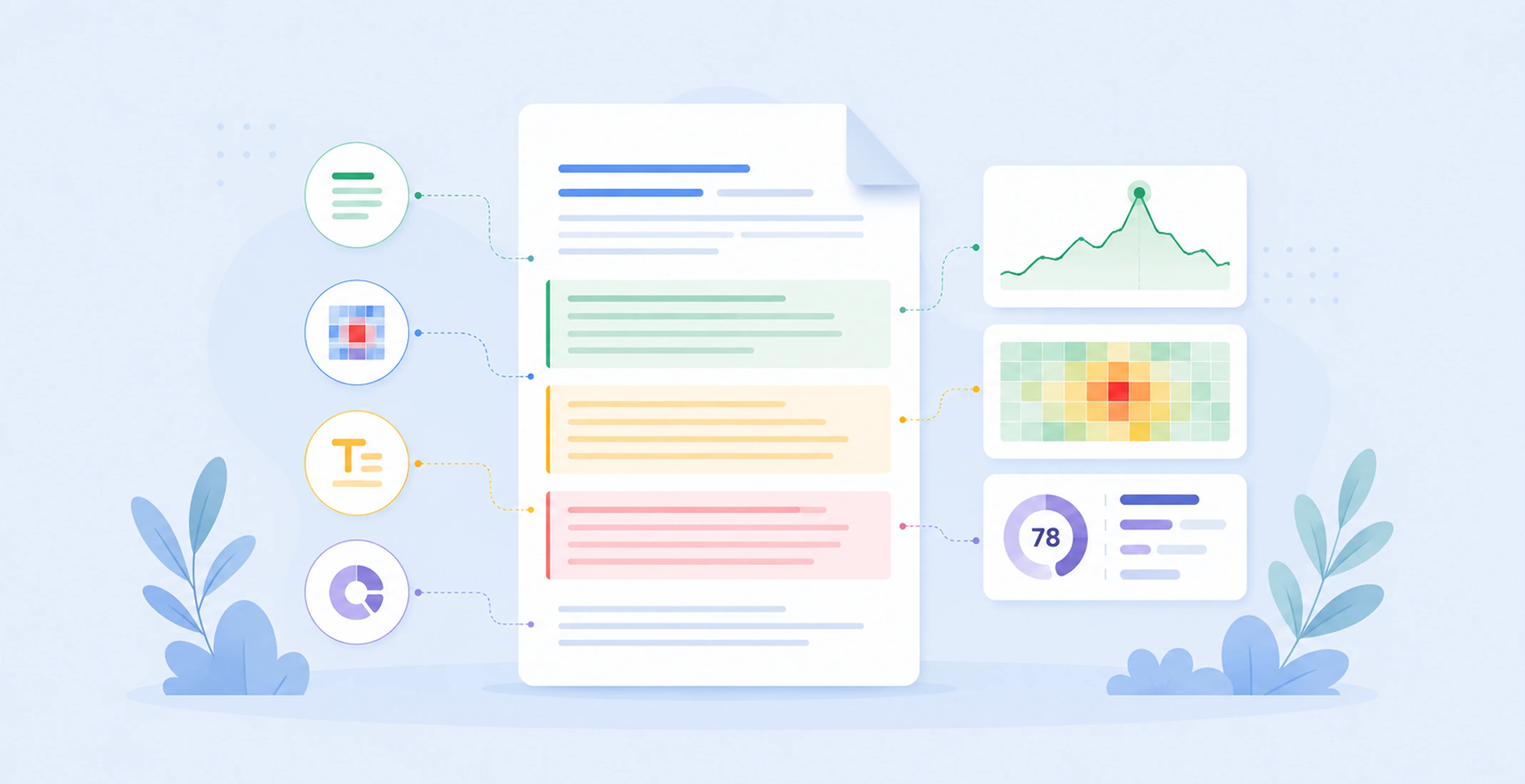
AI document analytics: how paragraph-level insights, heatmaps and readability analysis improve documents

Key Takeaways
AI document analytics helps you understand what happens after a document is opened.
Instead of stopping at views or downloads, it shows which pages, sections, and sometimes paragraphs hold attention, where readers slow down, and where they drop off.
That matters for proposals, reports, legal documents, financial documents, and internal knowledge bases because it gives teams evidence for improving clarity, structure, and workflow, rather than guessing what went wrong.
Introduction
Most teams still know very little about how their documents perform once they leave the building.
A proposal gets sent. A report is shared. A financial advice pack goes to review. A legal document is circulated internally. You may know the file was opened. You may even know how many times it was viewed. What you usually do not know is which sections were read carefully, which parts were skimmed, where attention dropped, or which paragraphs created confusion.
That is where AI document analytics becomes useful.
Instead of treating a document as a static PDF or Word file, document analytics software can track reading behaviour at the document, page, section, and sometimes paragraph level. Some tools add document heatmap analytics, attention heatmaps, and AI readability analysis on top. Others combine those signals with document processing, extraction, or workflow automation.
The result is a much more practical feedback loop. You can see which parts of a proposal buyers actually read, which sections of a legal document take disproportionate effort, or where a financial advice document creates friction during QA or compliance review. And once you can see that friction, you can start fixing it.
What is AI document analytics?
AI document analytics is the practice of measuring how people interact with documents and using AI to explain what those signals mean. It goes beyond “was the file opened?” and looks at things like page-level or section-level reading time, attention heatmaps, rereads, skipped content, and readability issues. The goal is not just reporting, but improving the document itself and the workflow around it.
That definition matters because “document analytics” gets used to describe a few different things.
Sometimes people mean document tracking, such as opens, downloads, or time spent on a file. Sometimes they mean document AI, where software classifies documents, extracts data, or turns unstructured files into structured outputs. Google’s Document AI overview, for example, focuses on OCR, extraction, classification, and splitting documents into structured data for downstream use.
AI document analytics sits a bit differently. It is less about reading the document for you and more about understanding how the document is being read by other people and what that means for content quality, workflow design, or business outcomes.
In practice, the category often overlaps with:
Intelligent document analytics, where AI helps surface patterns, bottlenecks, and likely problem areas
AI document insights, such as sections with high attention but low completion, or clauses that appear to create friction
AI readability analysis, where software flags complexity, jargon, long sentences, poor structure, or missing context
AI content optimisation, where those insights are used to improve the next version of the document
That distinction is useful because a team choosing software needs to know whether they are buying a document extraction engine, a document engagement analytics tool, or a broader workflow platform that combines both.
What does document analytics tracking software actually measure?
Document analytics tracking software usually measures a mix of engagement, attention, and content signals. At the simplest level, that means views, time spent, and completion rate. At a more advanced level, it can include page-level and section-level reading time, document heatmaps, rereads, drop-off points, paragraph-level engagement, and AI-generated signals about readability or likely confusion.
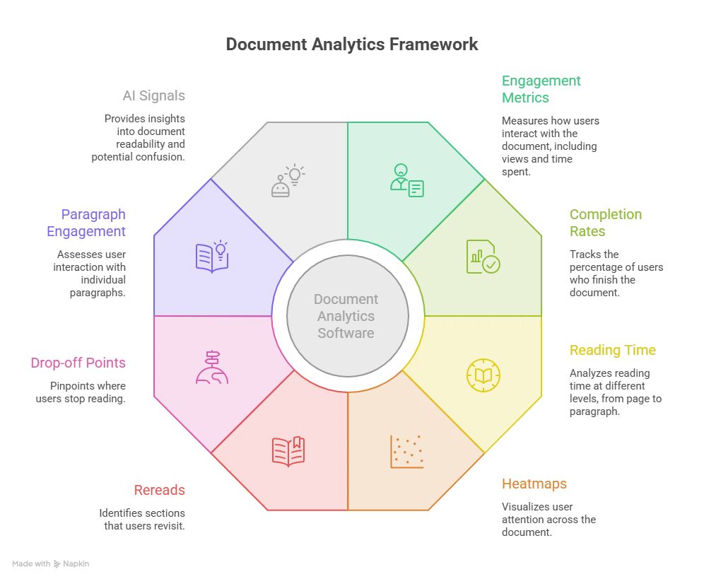
Document analytics software can measure engagement metrics, reading time, heatmaps, paragraph-level behaviour, rereads, drop-off points and AI signals to help identify confusing sections and improve document clarity.
The easiest way to think about it is in layers.
1. Document-level analytics
These are the basic signals most teams expect:
Document opens or views
Unique viewers
Total time spent on the document
Completion rate
Return visits or repeated opens
These metrics are useful, but they are blunt. If a buyer spent 12 minutes with a proposal, you still do not know which part of the proposal mattered.
2. Page-level analytics
This is where things start to get more useful. A tool can show:
Time spent on each page
Whether pages were skipped
Where readers stopped
Which pages were revisited
For short proposals or slide-style documents, that may be enough. But for longer reports, legal documents, financial advice documents, or internal policy packs, a page is often too coarse a unit of analysis.
3. Section-level document analytics
Section-level analytics breaks a document into meaningful chunks, such as:
Executive summary
Pricing section
Methodology
Risk disclosure
Implementation plan
Legal clauses
Policy subsections
Tools such as DocBeacon’s document engagement heatmaps explicitly position this as an advantage over page-only analytics by mapping attention and time spent to actual sections inside the document rather than just page numbers.
That matters because the question a team usually wants answered is not “How long did someone spend on page 14?” It is “Did they spend time on the pricing rationale?” or “Are readers getting stuck in the risk section?”
4. Paragraph level analytics and granular engagement
Some platforms go further and track smaller blocks of content. This is where paragraph level analytics and granular document analytics become relevant.
Depending on the tool and the format, that can include:
Which paragraphs were visible longest
Where readers paused
Whether a paragraph was reread multiple times
Where scrolling accelerated or stalled
Whether a block was consistently skipped
This is especially useful when a document has dense narrative sections rather than clean page boundaries. Think legal explanations, financial recommendations, board commentary, or knowledge-base procedures.
5. Attention and interaction signals
This is where document heatmaps and attention heatmaps come in. Microsoft Clarity describes attention maps as a way to understand what parts of a page users spend the most time on, with warmer colours representing more time spent. Contentsquare describes attention heatmaps in a similar way, as a view of where users spend the most time reading or interacting with content.
For document analytics, the equivalent idea is to show where attention concentrates inside the document itself.
6. AI-generated content signals
The most useful tools do not stop at behavioural data. They also analyse the document text and structure itself, for example by flagging:
Long, dense sections
Repeated concepts
Unclear headings
Missing definitions
Jargon-heavy paragraphs
Content that appears out of sequence
Sections likely to create confusion or abandonment
That is where AI document insights becomes more than a dashboard. It starts to become an editing and workflow tool.
Page-level vs section-level analytics: what’s the difference and why does it matter?
Page-level analytics tells you where readers spent time by page. Section-level document analytics tells you where they spent time by meaning. If your document structure maps cleanly to one idea per page, page-level analytics may be enough. If a page contains multiple topics, or if your document is long, regulated, or text-heavy, section-level analytics is usually much more actionable.
Let’s take a simple example.
Imagine a 25-page proposal. Page 8 includes:
Pricing assumptions
Implementation scope
Delivery exclusions
A short case study
Page-level analytics might tell you page 8 got heavy attention. That is interesting, but it does not tell you why. Was the buyer studying the scope? Questioning the exclusions? Looking at the pricing table? Reading the case study?
Section-level document analytics is designed to answer that more precisely.
The same applies to financial documents. A statement of advice or client recommendation pack might have a single page containing:
A recommendation summary
Fee explanation
Risk commentary
Next steps
If QA reviewers spend much longer on that page than expected, page-level data alone does not tell you which part created the delay. Section-level analytics can.
When page-level analytics is enough
Page-level analytics is often sufficient when:
The document is short
Each page has a single clear purpose
The layout is presentation-like rather than narrative
You mainly want a broad engagement signal
For example, a 10-page sales deck or one-pager may not need more than that.
When section-level analytics is worth it
Section-level analytics becomes more valuable when:
Pages contain multiple concepts
The document is long and text-heavy
The stakes are high, such as legal or financial documents
Multiple teams review the same file
You want to improve specific sections, not just the document overall
This is also where page vs section reading time becomes a useful diagnostic. If page-level time looks normal but section-level time shows one subsection is absorbing most of the attention, that usually points to one of three things:
The section is genuinely important
The section is hard to understand
The section is causing concern or disagreement
The next job is figuring out which one.
Document heatmaps and attention heatmaps: what can they tell you?
Document heatmaps and attention heatmaps visualise where readers spend time inside a document or page. Warm areas usually represent higher attention or longer time spent. Cold areas represent lower engagement, faster scrolling, or skipped content. Used well, heatmaps help you spot which parts of a document attract attention, which parts are ignored, and where readers may be slowing down.
Heatmaps are common in website analytics, but the same logic is increasingly being applied to documents.
Microsoft Clarity’s attention maps show where users spend the most time on a page and how long they view different sections. Contentsquare’s attention heatmaps similarly show where users spend the most time reading or interacting. DocBeacon applies that idea directly to documents by mapping engagement to document sections rather than generic pages.
For documents, that usually gives you a visual answer to questions like:
Which sections of the proposal are getting the most attention?
Is the pricing page being read or skipped?
Are readers spending time on the legal terms, or bouncing before they get there?
Does the executive summary hold attention, or do people jump straight to the technical appendix?
Are internal staff rereading the same policy section every time?
What a “hot” section might mean
A hot section is not automatically a good sign.
High attention can mean:
The section is important and relevant
the content is clear and engaging
Readers are comparing details carefully
The section is confusing and readers are stuck
The section contains a decision point or risk concern
That is why heatmaps work best when paired with other signals such as completion rate, drop-off, section rereads, or AI readability analysis.
What a “cold” section might mean
Cold sections can indicate:
Low relevance
Poor placement in the document
Headings that fail to signal value
Content that is too repetitive
Sections readers assume they can skip
Fatigue caused by earlier dense sections
In proposals and reports, cold sections are often where teams realise they are spending effort writing content nobody is reading.
How AI identifies confusing sections in documents
AI can identify confusing sections by combining reading behaviour with text analysis. It looks for patterns such as unusually long dwell time, repeated rereads, sharp drop-offs, skipped blocks, dense language, jargon, long sentences, weak headings, or missing context. None of those signals proves confusion on its own, but together they create a strong picture of where readers are struggling.
This is one of the most useful parts of AI document analytics because it turns raw engagement data into something a team can act on.
A confusing section often leaves a recognisable trail:
Readers slow down dramatically
They reread a paragraph or subsection
They drop out immediately after a block of dense text
They skip a section entirely
Reviewers leave repeated comments on the same area
Internal teams take much longer than expected to review one part of the document
AI can then compare those behavioural patterns with the text itself.
Common signals AI can use
On the content side, the software may flag:
Very long sentences
Stacked clauses or nested conditions
Heavy use of unexplained terms
Abrupt topic shifts
Headings that do not describe what follows
Duplicated points across sections
Important assumptions buried in the middle of a paragraph
References to prior context that is never actually explained
On the behaviour side, it may look at:
Time spent per section
Repeated visits to the same block
High attention but low progression
Drop-off after specific subsections
Different reading patterns across audience groups
For example, if a proposal’s “implementation assumptions” section consistently gets long dwell time, repeat views, and a high drop-off rate immediately after, that is often a sign the section needs work. It may be too vague, too technical, or structured in a way that forces the reader to hunt for the real point.
Why confusion is domain-specific
This is especially important in legal and financial documents.
A 2024 systematic review of readability metrics in legal text found that legal and regulatory documents often contain high linguistic complexity, heavy jargon, and structural features that make comprehension difficult, while the field still lacks consensus on the best metrics for measuring readability across different legal domains.
Financial documents have a similar problem. In a study on tracing content requirements in financial documents, researchers showed how AI can help identify relevant text chunks and missing information types across complex financial documents, with the broader goal of reducing manual review effort.
That matters because “confusing” does not always mean “too advanced.” Sometimes it means the document is forcing the reader to reconstruct the logic themselves.
A better workflow for fixing confusing sections
The most useful way to use this is simple:
Detect the section with unusual attention or friction
Review the text, structure, and supporting context
Rewrite the section, not just the sentence
Retest using the same analytics on the next version
That last step matters. If the section still causes the same behaviour, the problem may not be the wording. It may be the workflow, the missing context, or the assumptions behind the document.
AI readability analysis and content optimisation for high-stakes documents
Readability analysis is often misunderstood as “make the writing simpler.” In practice, it is more useful than that.
AI readability analysis looks at how hard a document is to process, not just how long the words are. It can flag sentence length, jargon density, passive constructions, nested clauses, heading quality, inconsistent terminology, weak structure, and missing context. In high-stakes documents, that helps teams improve clarity without flattening important nuance.
That distinction matters because legal, financial, and technical documents cannot always be “plain English” in the casual sense. They still need precision. The job is to reduce unnecessary friction, not remove necessary detail.
What readability analysis can improve
For proposals, readability analysis often helps with:
Overly dense solution descriptions
Pricing assumptions hidden in prose
Long implementation paragraphs with no structure
Weak executive summaries
For reports and board packs, it can help with:
Long narrative sections with no signposting
Data commentary that never gets to the point
Duplicated observations across sections
Jargon-heavy analysis that loses non-specialist readers
For legal documents, it can help surface:
Stacked definitions and references
Long clauses with multiple conditions
Terms used before they are explained
Blocks of text with no structural cues
For financial documents, it can help with:
Recommendation rationales that bury the key reason
Disclosures mixed into the middle of explanatory text
Repeated concepts phrased differently in different sections
Advice summaries that assume too much prior context
The key point is that AI readability analysis and AI content optimisation should support the document’s purpose, not chase a generic readability score.
If a section is complex because the underlying issue is complex, the right fix may be a better heading, a summary sentence, a table, a short definition, or a clearer sequence of ideas. It may not be a shorter paragraph.
Where AI document analytics is most useful
AI document analytics can be useful almost anywhere documents matter, but it becomes much more valuable when the document is tied to a commercial decision, a compliance process, or a repeated internal workflow.
Proposals and sales documents
Proposal teams often know whether a proposal was opened. They rarely know which parts actually shaped the buying decision.
Document analytics can show:
Whether the executive summary is read or skipped
How much time buyers spend on pricing, scope, and case studies
Whether implementation details are causing concern
Which supporting sections are ignored entirely
That helps sales and delivery teams improve the proposal itself rather than just guessing why a deal stalled.
Reports and board papers
Reports often fail for a simple reason: the key message is buried.
Section-level analytics and readability analysis can help teams see whether readers spend time on:
The summary and recommendations
The data appendix instead of the main narrative
One difficult subsection that slows everyone down
Sections that are long but rarely read
That is especially useful for recurring board packs or management reporting, where small improvements compound over time.
Legal documents
Legal teams are dealing with a tension between precision and usability. Analytics cannot solve the legal judgment side of that, but it can help surface where readers are getting lost, which clauses take disproportionate review time, and which supporting explanations are failing to do their job.
The legal readability research mentioned earlier is a good reminder here: readability in legal text is a real issue, but it is not solved by one score or one generic simplification rule.
Financial documents and advice workflows
This is one of the strongest use cases.
Financial advice businesses, lenders, and other document-heavy finance teams often have the same underlying problem: the document is only one visible part of a much larger workflow. Information is scattered across notes, forms, modelling tools, CRM records, compliance checks, and review stages. The document becomes the place where all that complexity lands.
That is why we tend to see the biggest gains when document analytics is connected to workflow design, not treated as a standalone reporting widget.
When we worked on Effort Lens, an AI workflow automation platform for financial advice, one of the recurring lessons was that document friction rarely starts inside the document alone. It often starts much earlier, with scattered information, repeated re-entry, weak traceability, and too much time spent reconstructing context. That is part of the reason the platform was built around the full advice workflow, including meeting capture, fact finding, QA, compliance, and document generation, rather than only the final advice document. You can see that approach in our Effort Lens case study.
The same logic applies if you are building broader fintech software development workflows or trying to operationalise AI across financial teams. Document analytics is most useful when it helps you reduce review effort, improve consistency, and expose bottlenecks in the surrounding workflow.
Internal knowledge bases and policy content
Internal knowledge bases are a quiet but important use case.
Most teams have no real visibility into which SOPs are read, which policy sections cause confusion, or where onboarding material loses attention. Section-level analytics and readability analysis can help identify:
Policy sections nobody reaches
Procedures people reread repeatedly
Onboarding guides that are too dense
Knowledge articles that need a summary, diagram, or rewrite
That makes internal documentation less of a publishing exercise and more of a measurable operational asset.
How to choose document analytics software
There is no single “best” document analytics platform because the right choice depends on what you are actually trying to improve.
If your main problem is extracting data from invoices, forms, or financial statements, you may need intelligent document processing first. Platforms such as Google Document AI are designed around classification, extraction, and structured outputs rather than reader engagement.
If your main problem is understanding how people read long proposals, reports, or internal documents, then engagement analytics, section-level heatmaps, and readability features matter more.
If your real problem is workflow bottlenecks around document-heavy operations, then the best answer may be a broader AI workflow system rather than a standalone analytics layer.
Questions worth asking before you choose
1. What level of granularity do you actually need?
Ask whether the tool supports:
Page-level analytics
Section-level document analytics
Paragraph level analytics or equivalent granular views
Page vs section reading time comparisons
Document heatmap analytics or attention heatmaps
If your documents are long and text-heavy, page-only analytics will often be too limited.
2. Does it help you identify confusing sections, or just show raw metrics?
A dashboard full of time-on-page data is not enough. Look for features that support:
AI readability analysis
Flagged sections with likely friction
Reread and drop-off patterns
Workflow-friendly reporting, not just charts
3. Is it built for your document type?
A proposal workflow, a legal review workflow, and a financial advice workflow have different requirements.
For finance teams, you may need document analytics to connect with broader document processing, structured extraction, review stages, and auditability. That is where a mix of analytics, AI document processing, and system integration often matters more than one isolated feature set.
4. How does it fit into the rest of your stack?
This is a big one. A document analytics tool becomes much more useful if it can connect to:
CRM systems
Client portals
Document management systems
Knowledge bases
Workflow tools
Compliance or QA processes
If the insights live in a silo, teams tend to look at them once and move on. If they feed into real workflows, they become operationally useful. That is why we usually treat analytics and integration as part of the same conversation. If you are evaluating how those systems should connect, our API integration services and our guide to API integrations in practice are often the more relevant starting point than the analytics tool alone.
5. What are the privacy and governance implications?
This matters even more in regulated industries.
You need to know:
What user-level tracking is stored
Whether documents are used for model training
What audit trail exists
How permissions work
Whether data stays in-region if that matters to you
How the tool handles sensitive financial or legal documents
6. Will the tool help you improve the workflow, or just the file?
This is the most important question of the lot.
If the answer is “we will know which page was viewed most,” that may be useful, but it is not enough. The better question is: What decision will this insight help us make?
For example:
Rewrite a pricing section
Restructure a report summary
Shorten a policy article
Add missing context to a legal explanation
Reduce compliance review time in a financial workflow
Identify where information is being duplicated across documents
If the tool cannot support those next steps, it may not solve the problem you actually have.
If you are exploring AI document analytics for financial workflows, document-heavy operations, or a regulated advice process, we can help you think through both the software side and the workflow side.
Conclusion
AI document analytics is useful for a simple reason: it gives teams visibility into what happens after a document is opened.
That visibility matters most when the document is doing real work, winning business, supporting compliance, explaining advice, guiding internal teams, or carrying operational decisions. In those cases, it is not enough to know a file was viewed. You need to know where attention went, where friction appeared, and what should change next.
The strongest document analytics setups usually combine three things:
Granular visibility, such as page-level, section-level, or paragraph-level insights
Content intelligence, such as readability analysis and AI signals about likely confusion
Workflow context, so those insights feed back into the systems and teams that own the document process
You can start with our AI software development services, look through the Effort Lens case study, or talk to a Fractional Head of AI if you need help deciding what should be built, integrated, or automated first.
Ready to Explore AI in Your Projects?
Let’s talk about how AI models can accelerate your engineering workflows
and unlock new possibilities.
